A different, modern neighborhood.

The problem

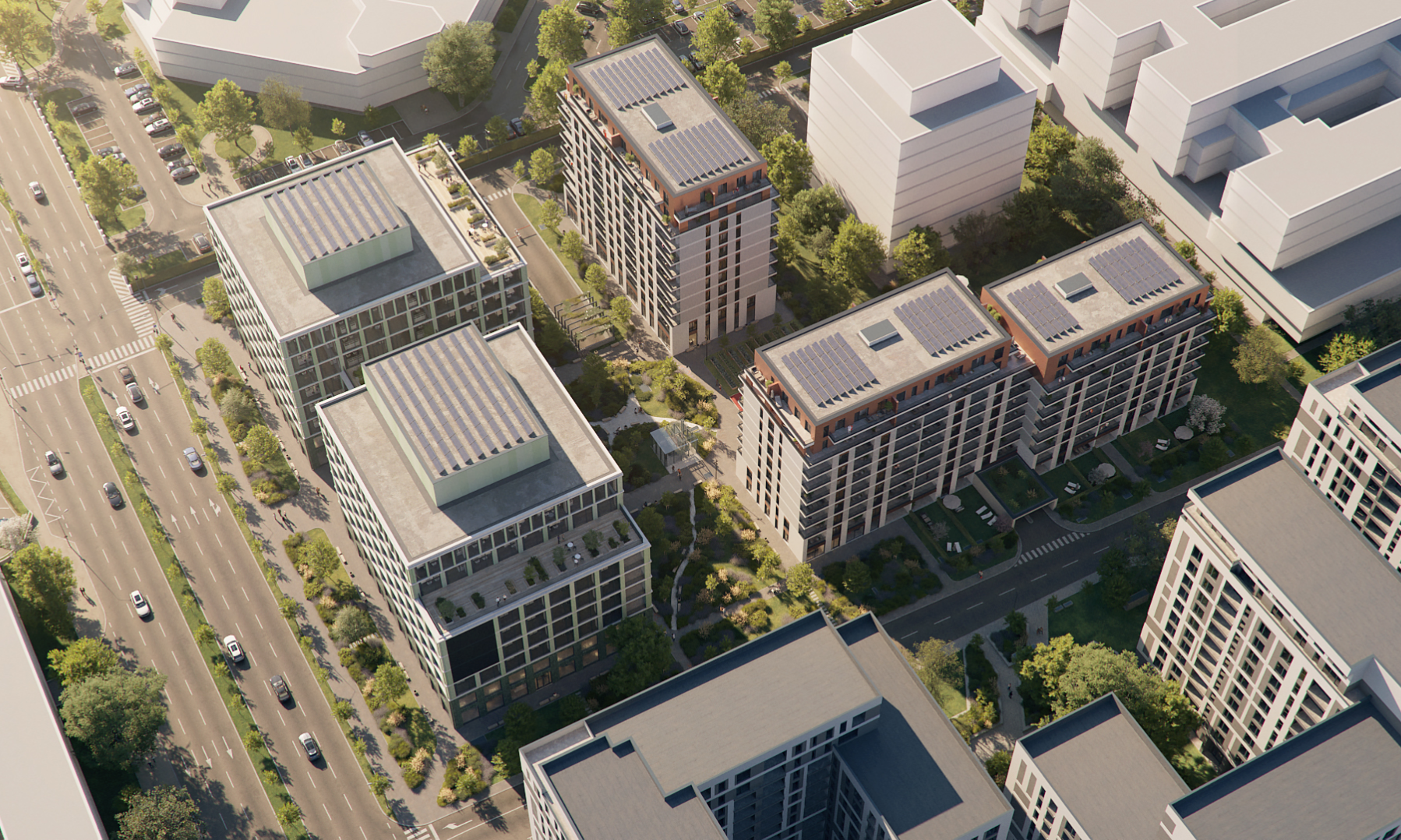
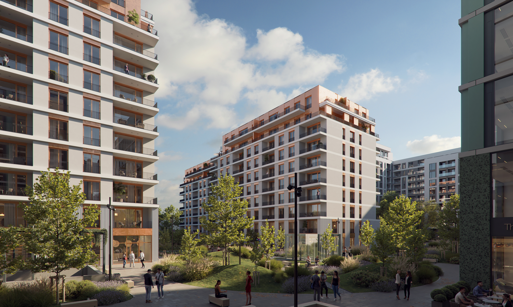
Queens District is a real-estate project belonging to Speedwell company, which consists of 5 buildings developed in the northern Bucharest area. The buildings are modern, built with sustainability in mind, and are placed in one of Bucharest’s most green and expensive neighborhood.

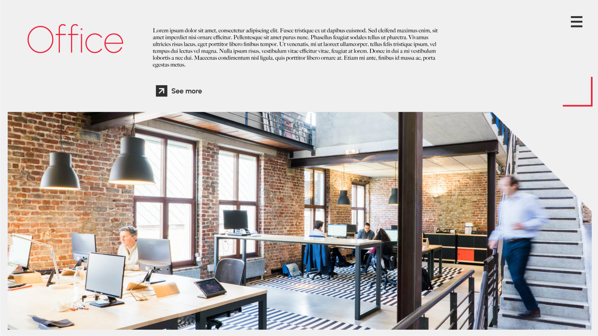
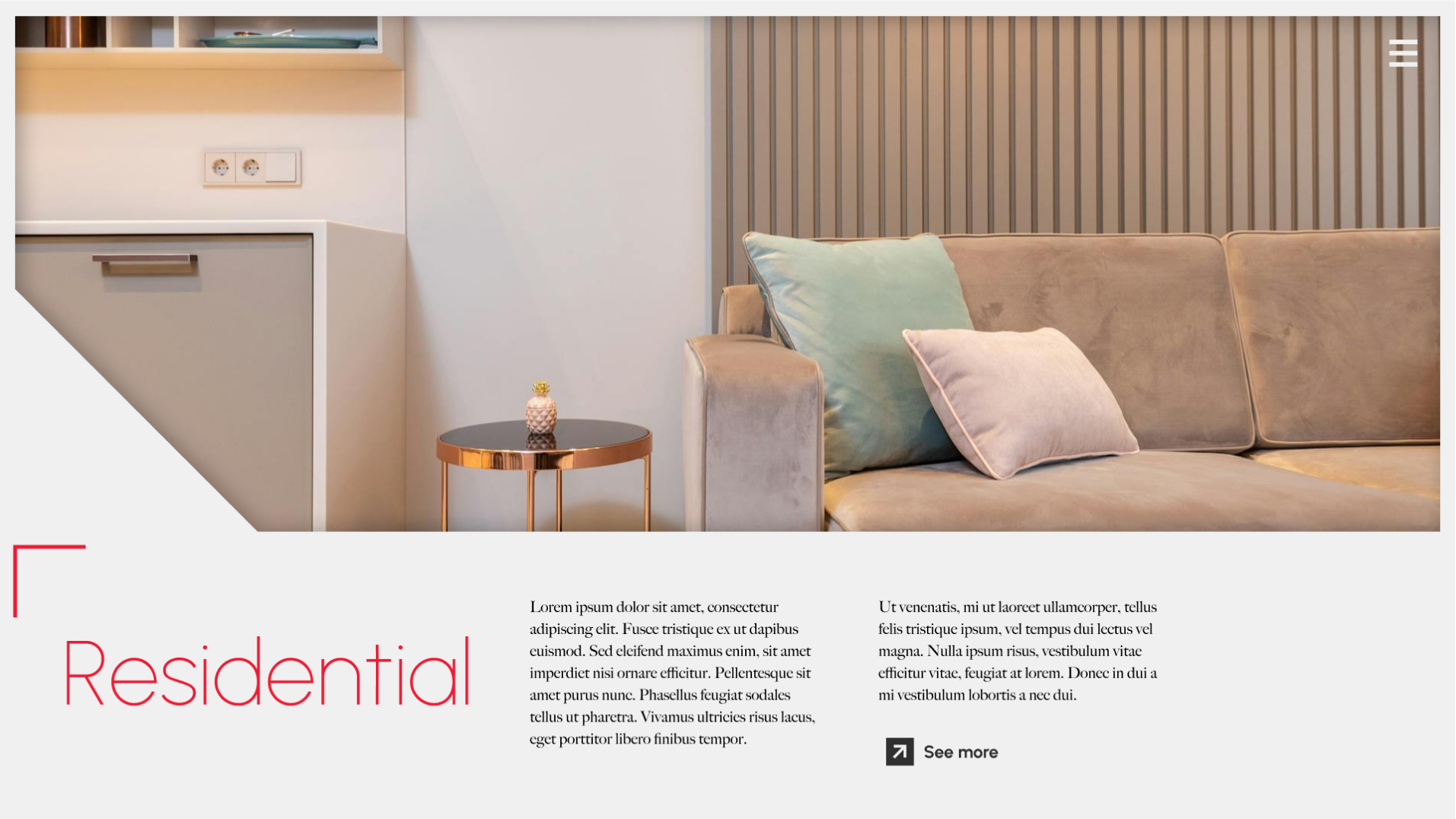
The real problem though, is that besides the great advantages the project presents, the area itself is quite small. The buildings are developed near another set of real estate buildings and a hospital. My client wanted a couple of integrated deliverables, including a website and a brochure outlining the place meant to appeal to office, retail and residential clients. This was a real challenge on multiple levels: create a website that appeals to three categories of users, and create the feeling of space in a pretty cluttered neighborhood.

The client showed me different websites that would constitute the competition from his point of view, so this way, I did have a point where I could start from. Still, I also did my own research and scouted some websites in Romania that could be part of the competition.

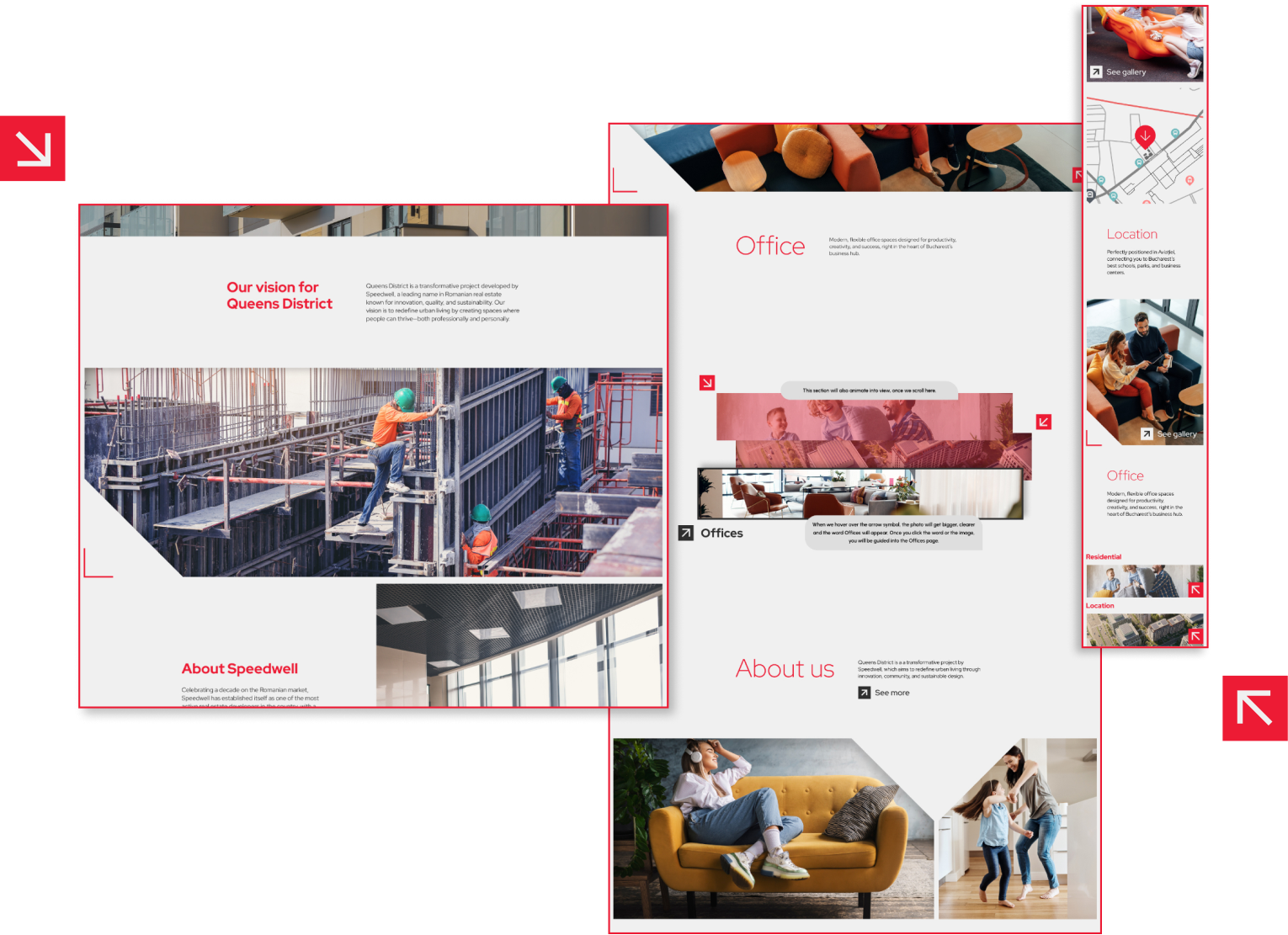
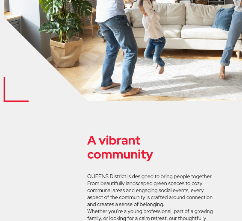
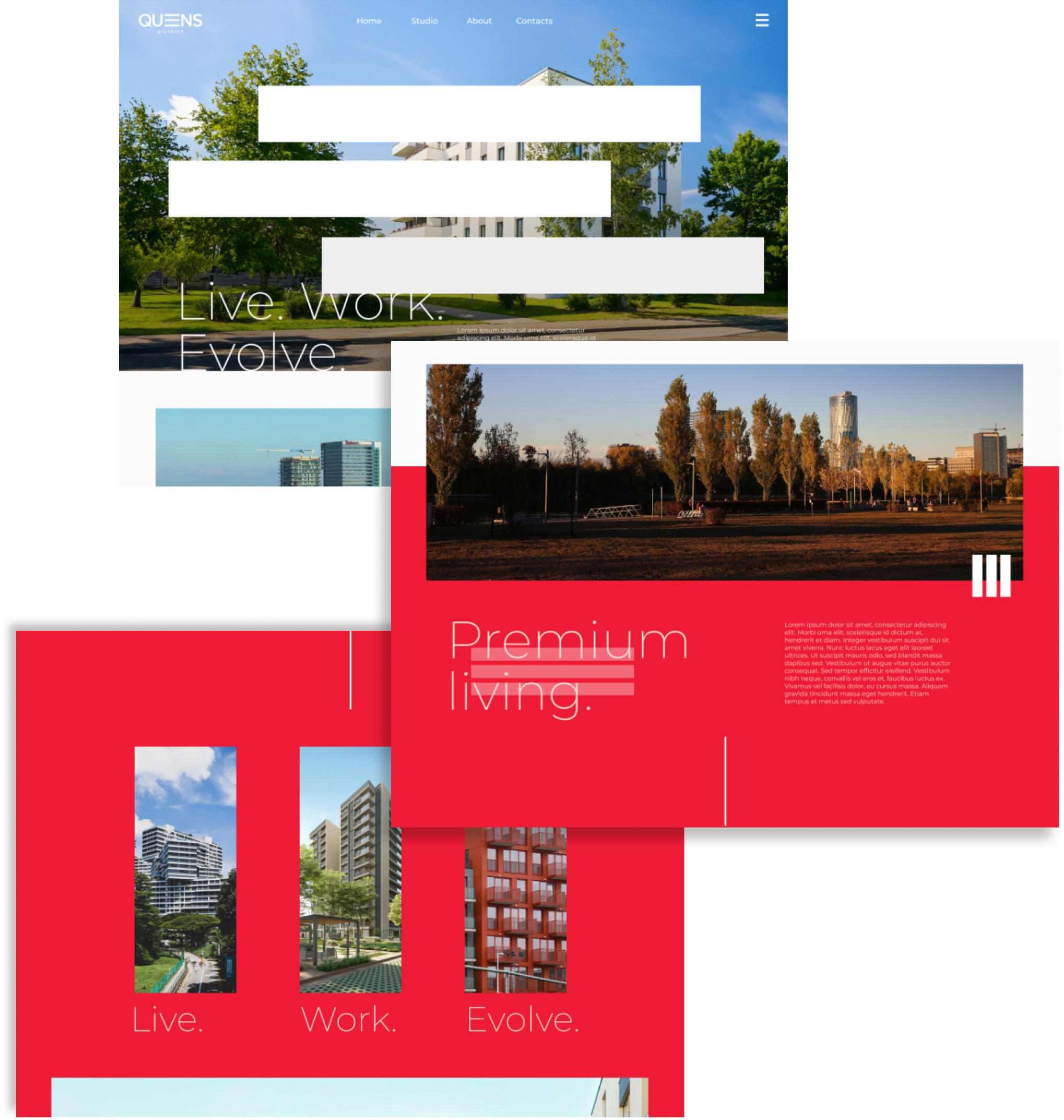
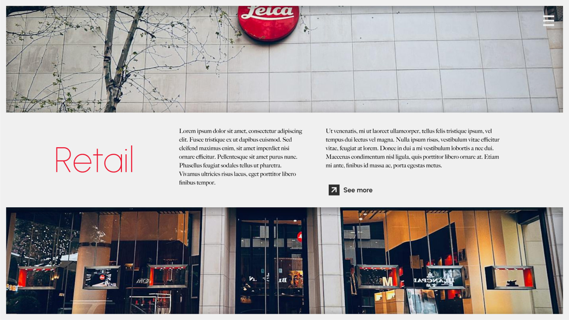
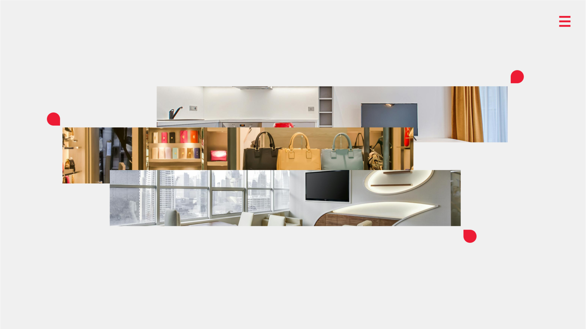
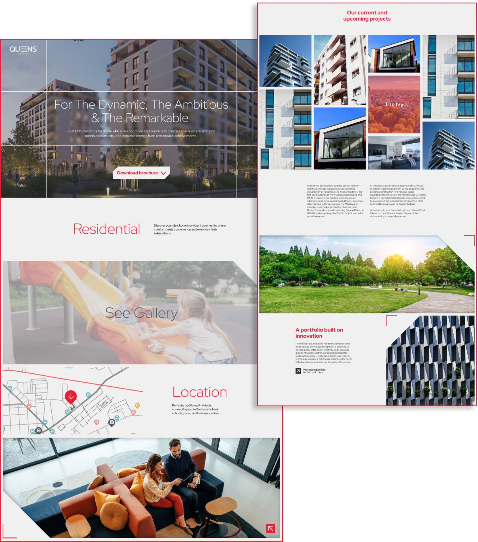
I knew one solution would be to use white space when it comes to creating this feeling, but I know that in real estate, photos and videos are the most important form of communication and content, so I chose to expand the photos instead. What I did to create this idea of space was creating an element that would cause sections to ‘blend into each other’ and so, in this way, the website would seem a bit more spacious together with the images.

Ideation

This particular project has a lot of iterations. There was a lot of back and forth with my client because he wanted a more immersive design, something that would keep clients browsing the website. He wanted to sacrifice simplicity for a design that would tell a story and that would help users interact more with it, so I had a lot of work and fun :)

Here you can see the main color grid. I used an off-white for the background, it is less straining for the eye when browsing. I did the same with the black, it's actually a deep gray. From a User Experience perspective, using deep gray and off-white instead of pure black and white contributes to an over-all better browsing experience.

I actually used real white as an accent throughout the website. This way, I can actually point out elements as needed.

Default button

Hover button

I chose this design for the buttons because it mimicks a building indicator.

Initial Prototypes

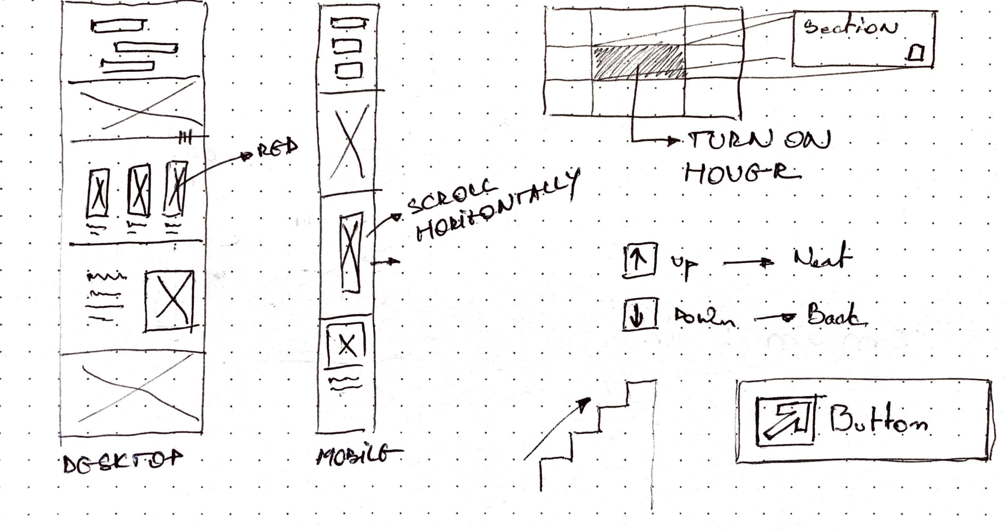
Because the deadline was pretty tight, my client asked that I skip the wireframing stage, so initially I went on to design a relatively simple website, a first draft. My client outlined a few elements that he wanted to see in this particular iteration, he wanted the website to be simple, to the point, and to have some gimmicks in order to better illustrate different qualities the buildings and the place have.

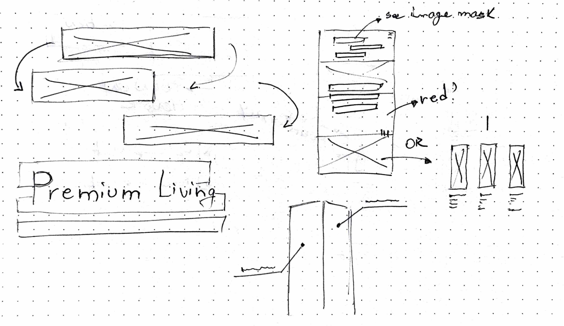
Upon seeing the first iteration, we thought it’s way too similar to something a user would usually see on a reaI-estate website and decided to go on a different route, making it entirely different. I thought about making it entirely landscape. Below is a second iteration of the website. I realized that the layout would not be feasible because of the amount of content present on it.

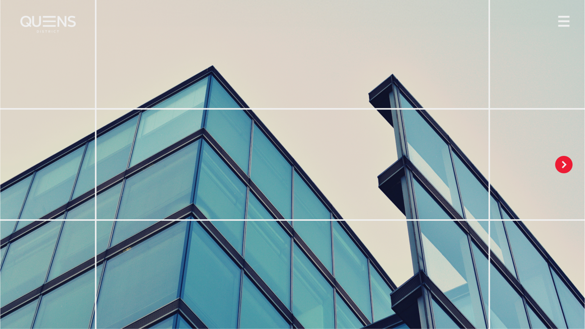
What I did in the third iteration was to create this immersive experience through different sort of gimmicks that would aim to enrich the user experience, while keeping the website functional and spacious.

Final Prototype

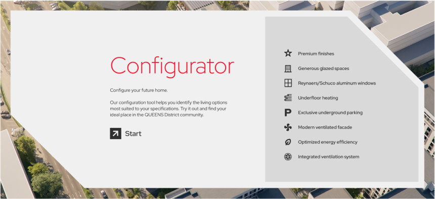
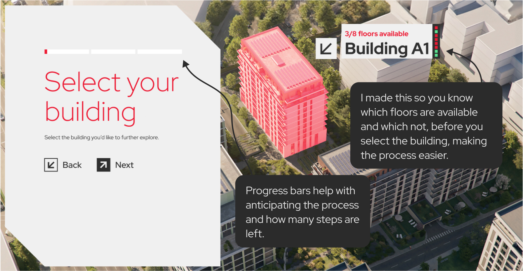
One of the elements I enjoyed most and was most challenging was the Configurator. I wanted the configurator to be a great experience from an UXUI point of view. It has four stages: start, building select, floor select and apartment select. It was made so it would be easier to see your potential home and contact the developer about that particular apartment.
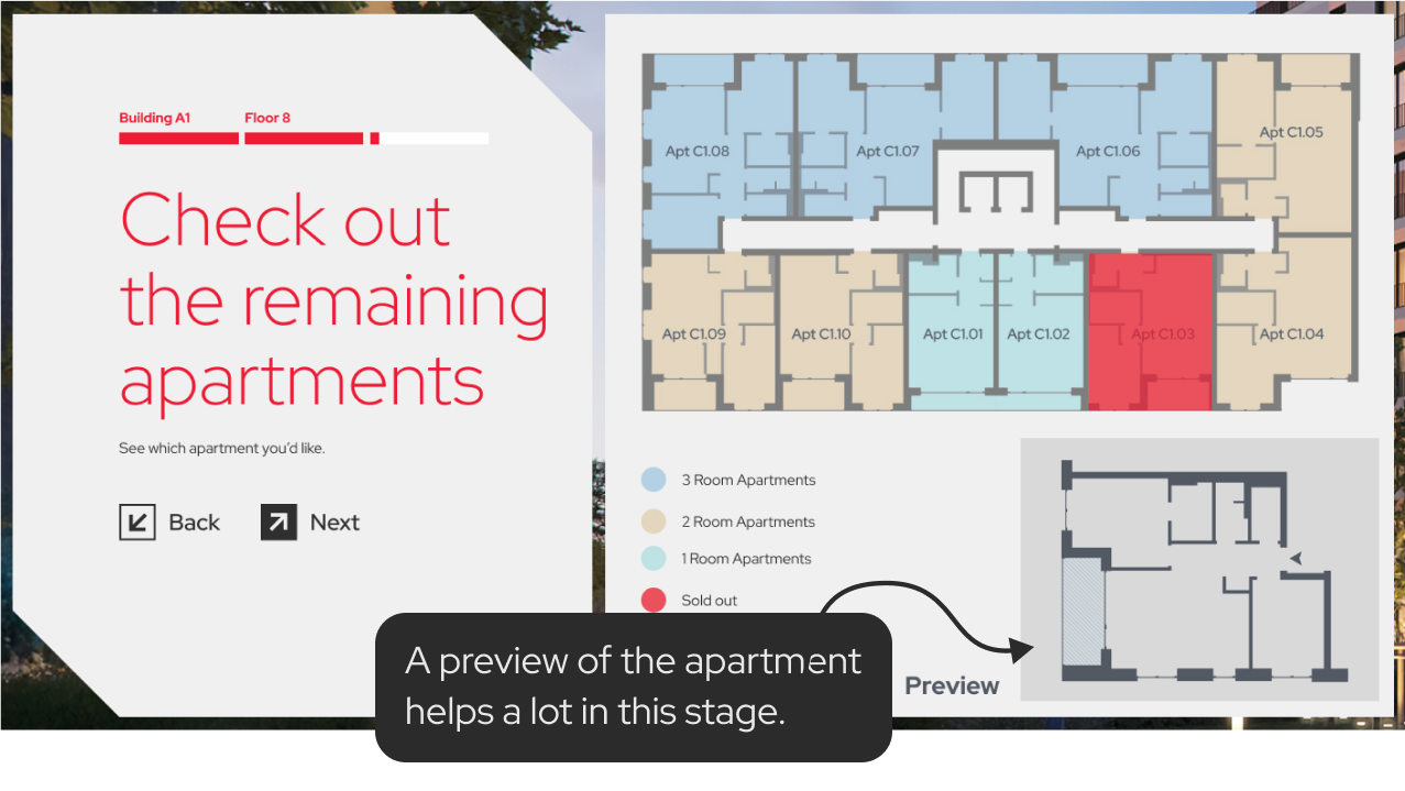
I closely studied other forms and quizzes that are done correctly from an UX/UI point of view and I applied those principles here. For example, a progress bar is very important and it helps keep the user engaged in the process because it offers predictability: as a user, I know how much longer I have to sit and do this. Another important point was the building selection. I wanted to offer predictability here too, so I devised a set of gimmicks that would tell the user details of the upcoming stage. This way, I minimized the annoying ‘back and forth’ process.
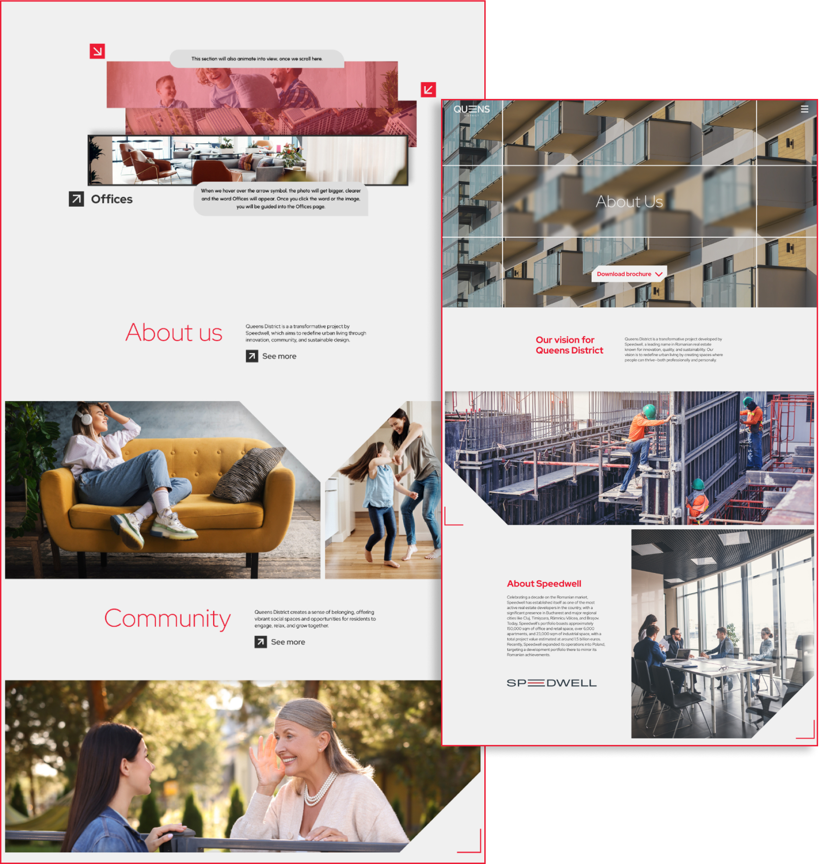
The website has plenty of on-scroll animations, but studying closely the user’s behavior gave me a good insight: animation overload. When there are too many things moving the eye gets tired and it’s more likely for the user to quit browsing. In our perception as designers or as investors, we generally think that animating or popping or highlighting would result in an ideal time spent using or interacting with our product. That is not true all the time. Eye-strain, rest and spaciousness are factors that always have to be taken into consideration.