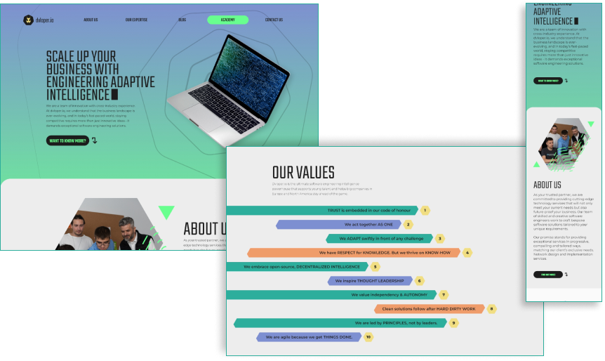
Making the most of accessibility and function for a digital business.

The problem

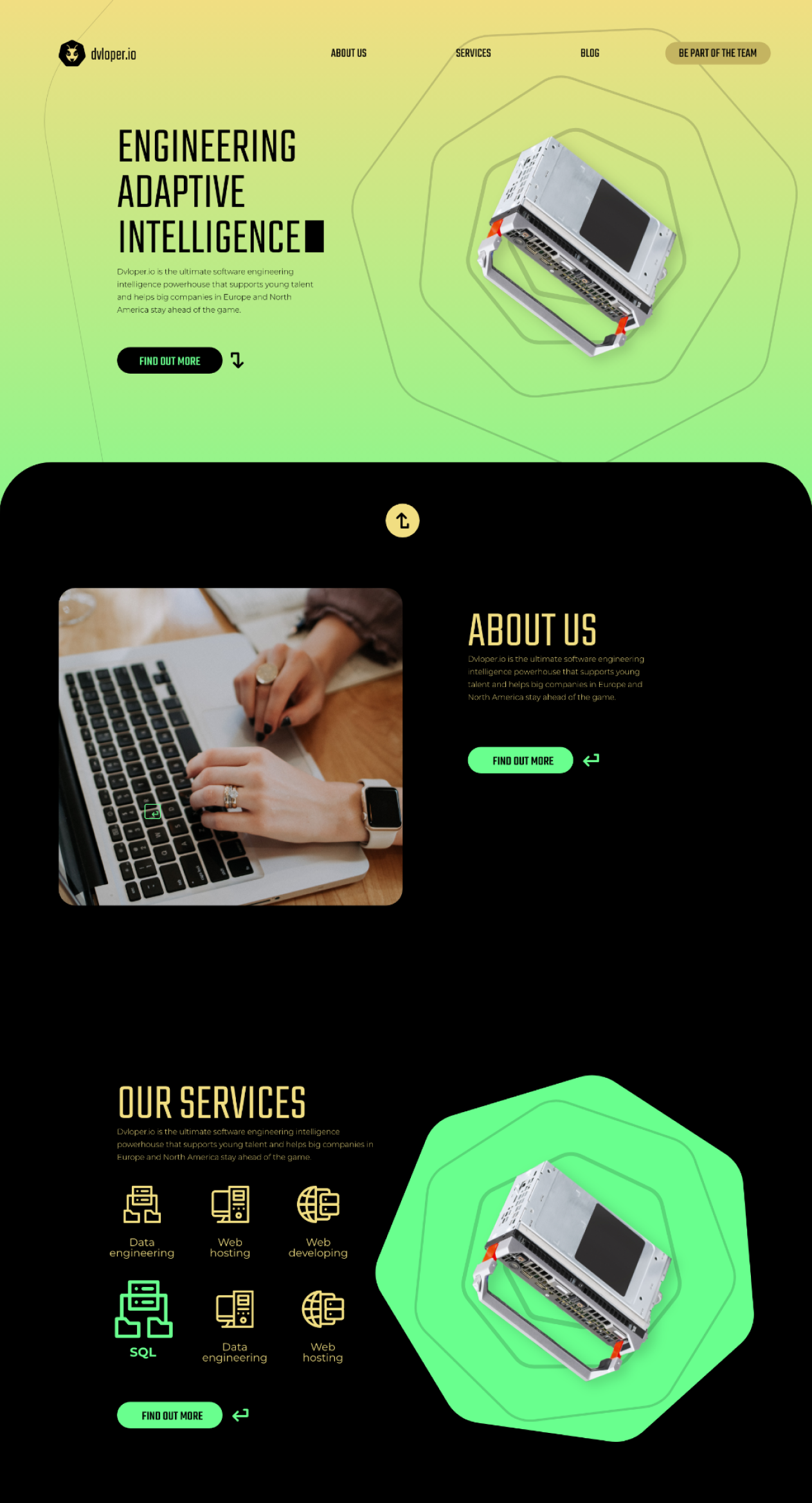
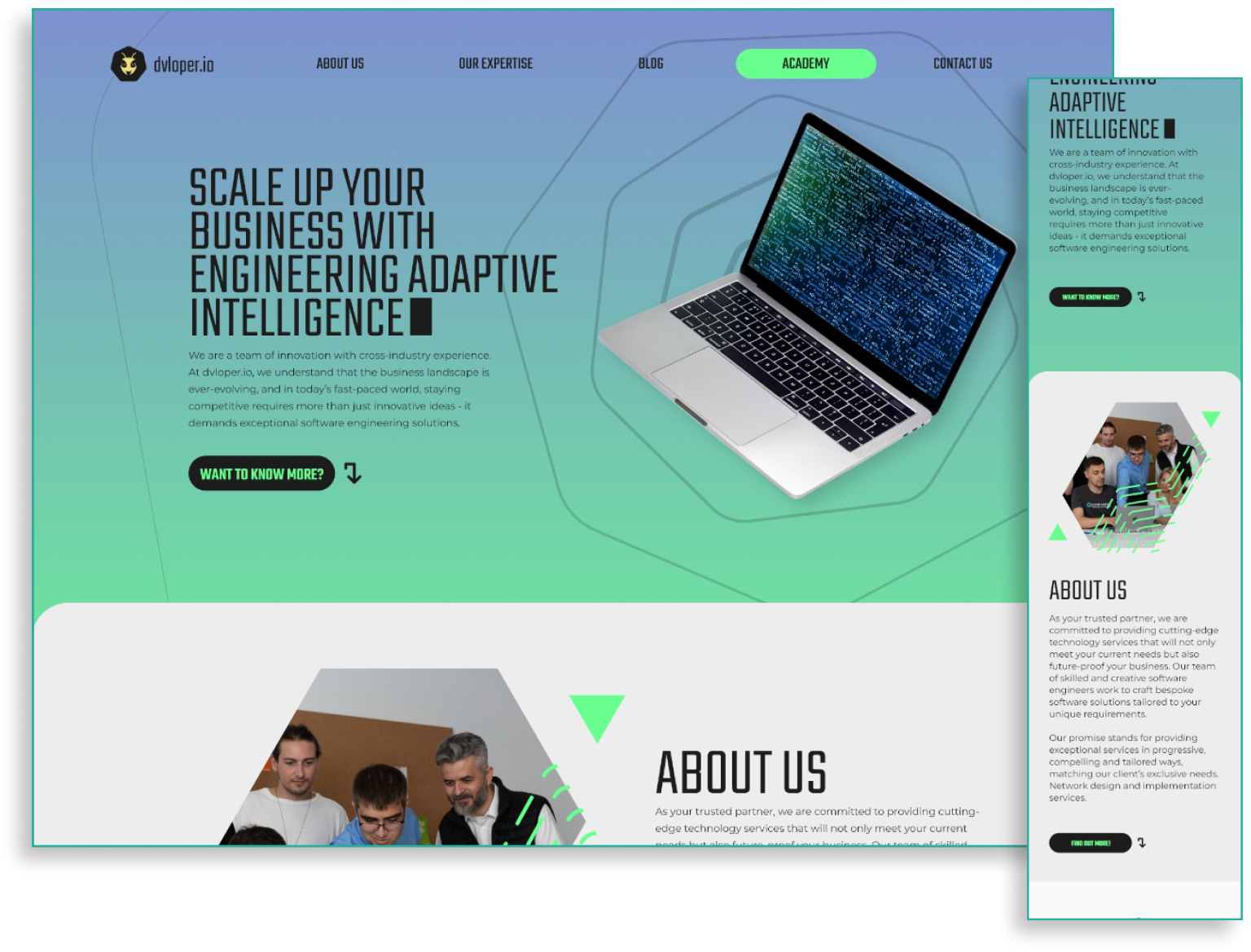
A fast-evolving start-up with a pretty big active portfolio, looking to expand their business and appeal to different clients, Dvloper.io is a company full of young antrepreneurs, full of creativity and motivation. The CEO asked me to design a logo, brandbook and website that reflect their organisation and their personality as a whole.
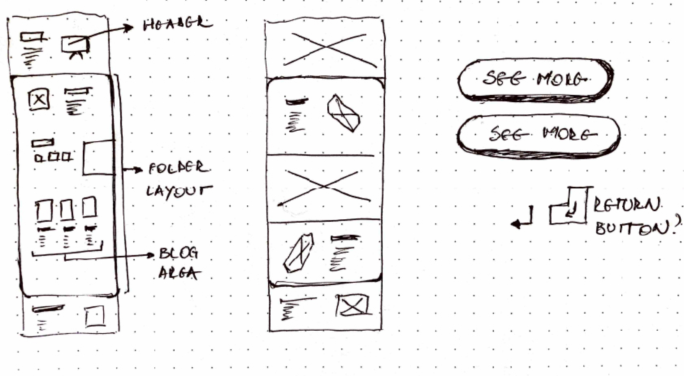
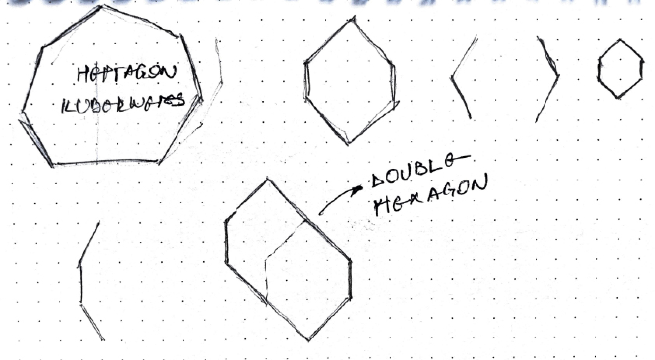
Research

I started by identifying their flow and personality as a company. I got to meet the team, understand how they worked and based on that, I developed a personality that me and my client thought suited the company well. I was familiar with other companies with the same “smart playfullness” approach, and I wanted to give this one a twist towards familiarity, while keeping the professional tone.

Ideation

Next up came the logo and typography. The logo process was a long one, with several logo versions along the way, in which I tried to capture the quality and working process of Dvloper.io team.

The efforts ended with the last logo which was very admired by my client. The logo symbolises a bee, the team was very excited about the idea of a beehive, so I went ahead with different versions that played on this idea until I came up with this one. The colors and gradients I chose for the brand captured this idea of open-minded professionalism, which was a blend between playfullness and openness I wanted to capture.

I also started working on the website, and after some initial sketches of the sitemap and a bit of inspiration from the brand, I went ahead and made up a symbol which was a combination between coding brackets and a hexagon used by bees in a beehive. I wanted this shape to govern the website design, giving it its unique quality and voice. I occasionally alternated this shape with a heptagon, used by most developers to reference Kubernetes. This symbol gives them credibility across the industry.

I wanted the button to have this gimmick inspired from the old Enter symbol. I designed this because it communicates old knowledge and the colors communicate modern thinking and implementation.

Default button

Hover button

Alternate button color

Above was the initial alternate color of the button, but in the final prototypes I changed it to yellow.

Final prototype

The final prototype included a couple of new pages based on the initial design and a mobile interaction with the same design applied. Here the tricky part was to include the shape designed and make it compatible with the rest of the pages, but after a few initial tests before the initial prototype, everything came up very well.

This is the blogpost page template. I designed it that way because I wanted to underline the difference between the blog and the rest of the website. Blogs can change and update more often than websites and I think it’s important to underline that in the user’s perception.