Making the most of accessibility and function for a digital business.

The problem

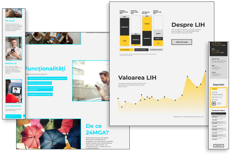
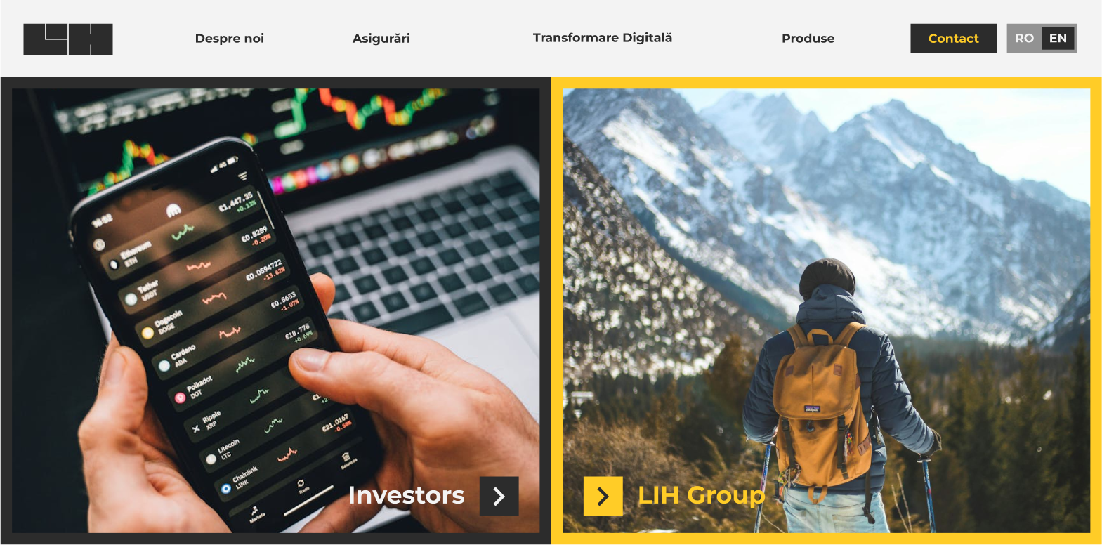
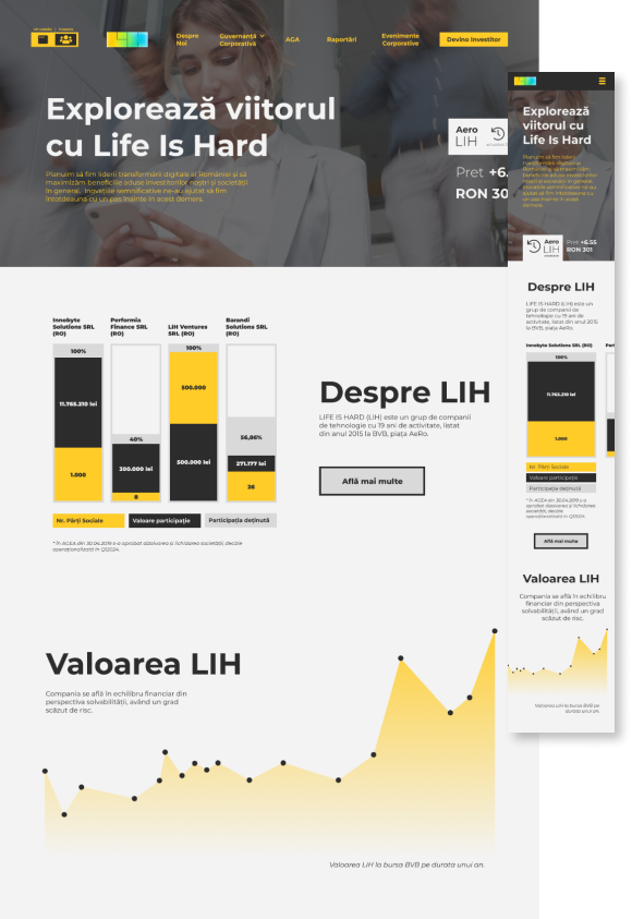
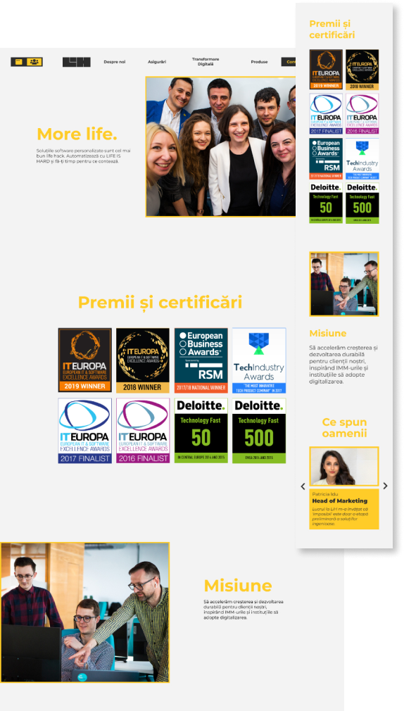
Life is Hard (LIH) is a business from Cluj, Romania, which specialises in digitalisation and insurance for emerging businesses. They needed a functional and clear website hierarchy that would outline their identity and their services well on web, as well as on mobile. The website had a lot of content to manage, and this was a rather complex project.

Research

This first step proved rather challenging, as I had trouble finding a clear industry for this business. LIH seemed to have no competition in Cluj or in Romania, and this proved easy, because I could go anywhere with the business persona, but also hard because it was hard to place them from a strategy and design point of view.

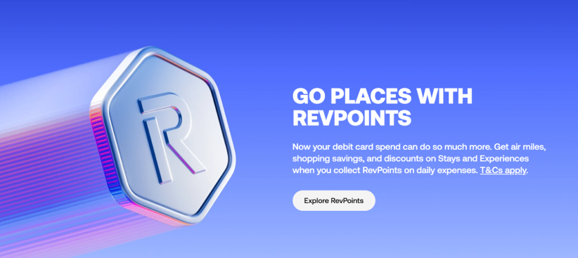
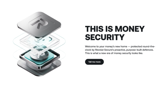
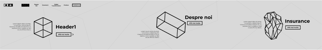
After a couple more discussions with the team, I decided to gather some references from the banking industry, even though LIH was not part of this industry, it fitted pretty well at least from a design stead point. Revolut was one idea, I liked the modern, curvy lines and the color palette and I liked the combination with 3D objects that is part of their design style. My client wanted less bold from this point of view and more functional. He wanted a website that would appeal to a larger group of people and was more clearly business-oriented, but he liked the boldness of the colours, so I tried to keep that.

Ideation

I started with the brand of course, the logo was already there, but my client wanted more thought put into the whole brand, so I went ahead and chose a color palette that would better suit the brand, its target audience and its persona. I started working on a clear and integrated brandbook and made an initial sketch of different web elements.

After I finished the bandbook, I started sketching some ideas for the website itself, together with some wireframes.

Initial Prototype

The initilal prototype was supposed to be more presentation-oriented, and so I thought of a horizontal layout similar to my other project, Erbario, but this time, I wanted to suggest this idea of evolution, or pushing forward through technology and innovation. I designed these different geometric objects that were supposed to get from simpler to complex as the user browses the homepage, in order to suggest LIH’s quality of work over time and the result of their impact on other businesses.

I decided to keep the ‘boldness of Revolut’ through the color palette, and bring the function part of the website through clear geometric shapes and a variety of grays. I thought of the meaning of colors when I thought about the brand: blue meaning security, green good or sustainable, and yellow usually being associated with action or energy. It was the perfect blend.

One of the more challenging scenarios was the hierarchy itself. There were two big components to this website: the ‘root’ or the ‘public’ website, and the one targeted towards investors. This was a complicated challenge from a user experience point of view, because they had to be placed within the same website, but they were separate websites in themselves, and also they had the same level of importance from my client’s point of view.

This is how a first prototype looked like. I decided it’s not the way to go. It was too confusing, and the users had to make a decision then and there and if not, they wouldn’t know where they are further down the page, and they had to go back here to decide.

Final prototype

No matter how hard I tried, I couldn’t overcome the confusion that came with the previous solution, so I came up with this button, and the decision to keep the main website as a first point in the hierarchy. Using this solution helps identify clearly where you are in the website, how to get to the investors website at any point during the navigation, and also to separate the main website from the investors website.