Balancing beauty and function with a restaurant menu website.

The problem

The first problem I encountered was that my client had the logo, but did not have the brand. This was the only thing that my client came to me with, and so I had to work with that. I liked the logo, I thought it reflected the brand quite well, but it wasn’t clear how. I wanted to make that clear before I started working on the website.

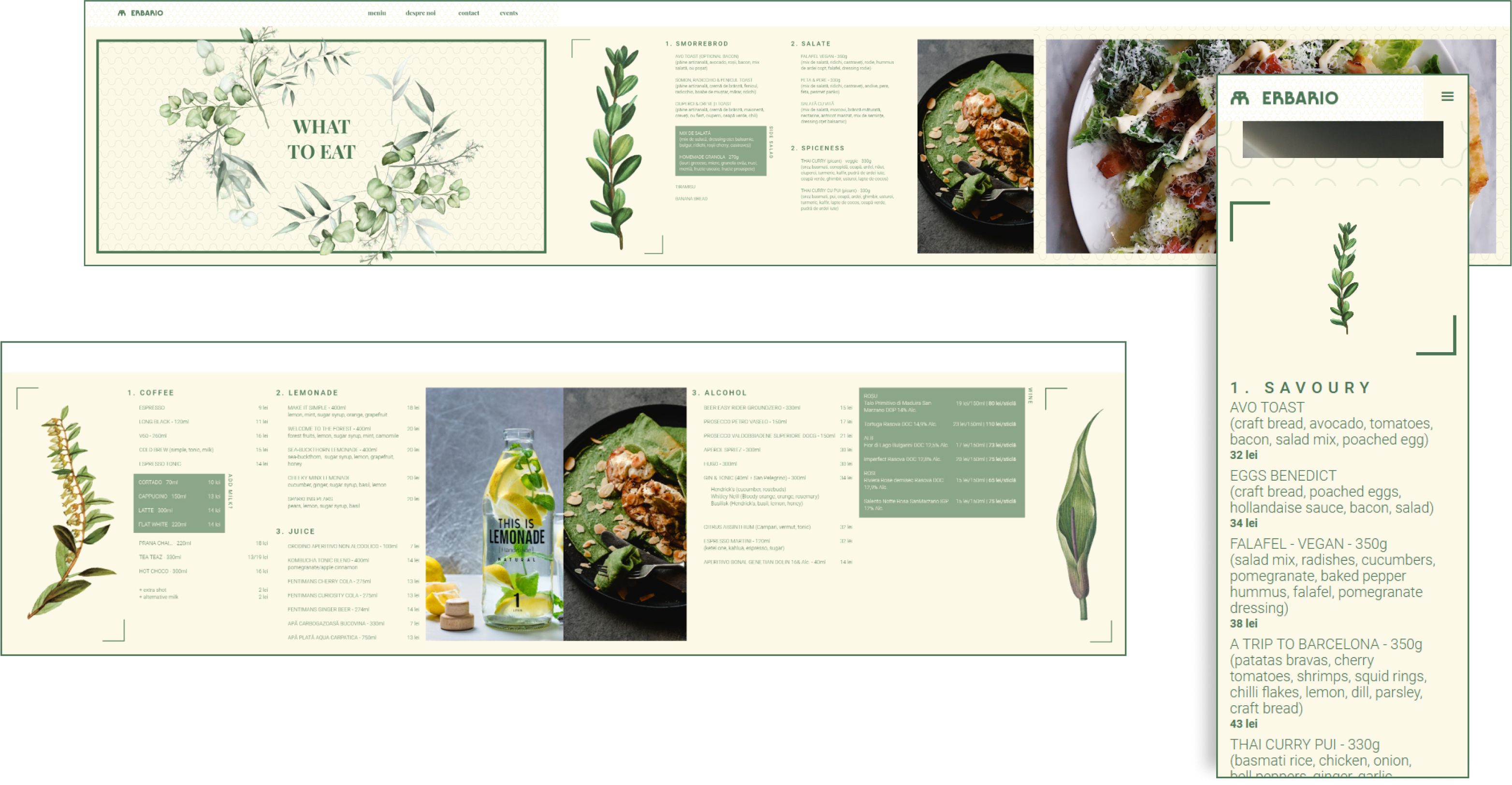
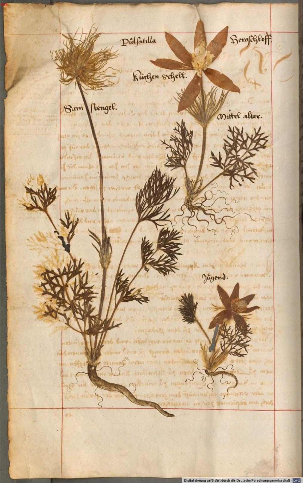
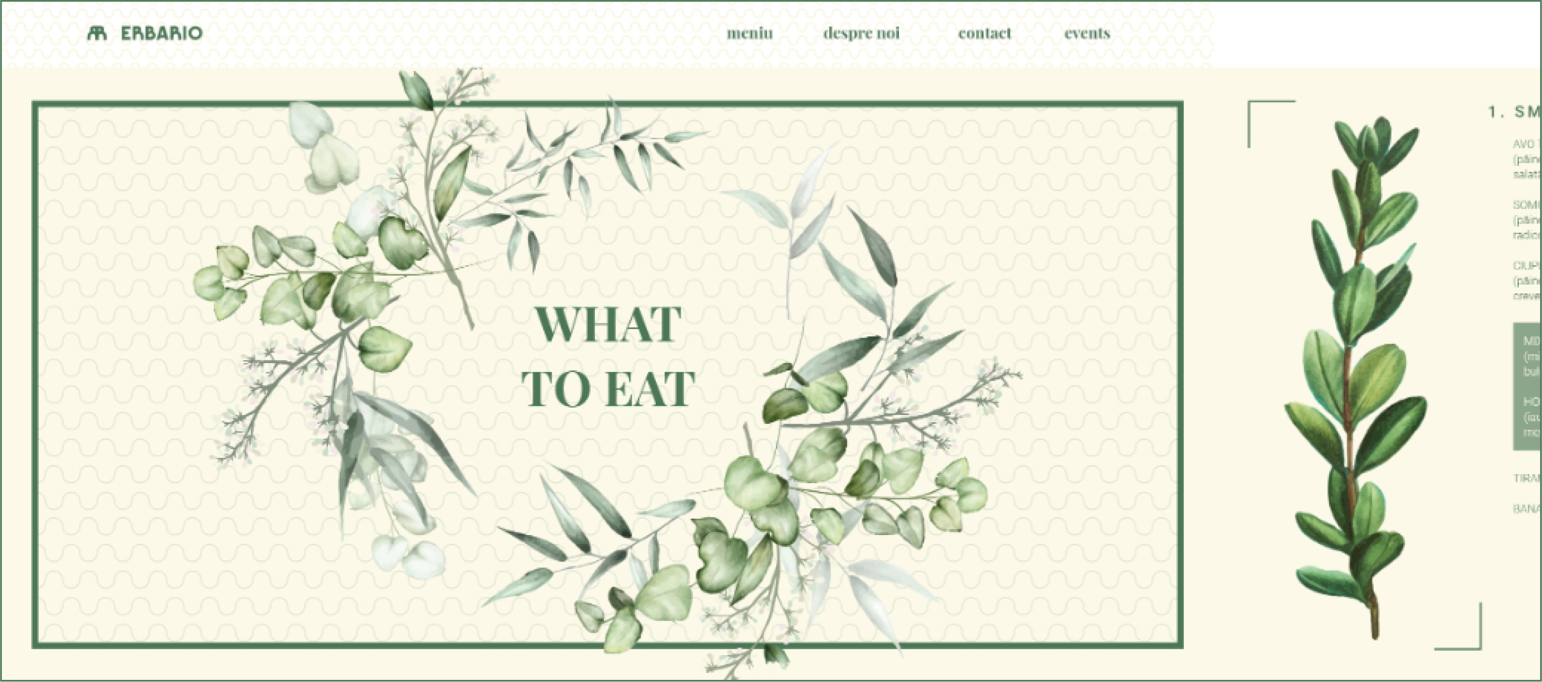
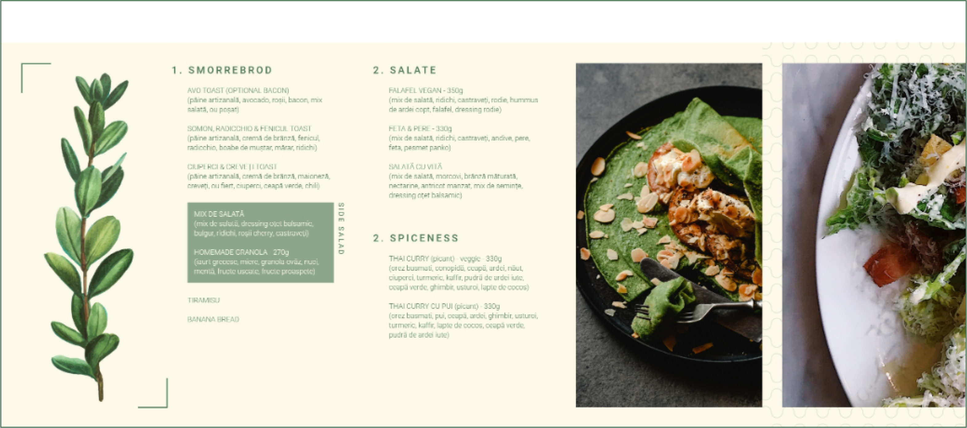
My client imagined plants everywhere, and she wanted the brand to reflect that. She wanted the restaurant and adjacent materials to the brand to look like a herbarium, so I started looking into similar niche restaurants, that had anything to do with plants.

Uf course, I had a look on some herbariums myself. After that, I made a deep dive into the brand, and made a clear set of colors, patterns and objects that we can use.

Ideation

After I established some solid basic brand guidelines, I started to work on the website. Because my client had this idea of Herbarium, I wanted the website to have that kind of touch.

After looking at some herbariums online, I saw that the aesthetics lie within the texture of the paper combined with the plant image. Some of them have some beautiful framed plants and small writings or definitions available. I wanted to capture that feeling and put it into the website. This is how I cam up with this main color grid to govern the brand and the website itself.

I meant to design this pattern in order to resemble a sort of fence that usually plants use to grow on. I also think it goes very well with the texture and feeling I wanted the brand to convey.

I decided together with my client to prototype and code the website myself using Webflow. I wanted it to be different from the majority of other sites from the same niche. Given the nature of herbariums and how the plants are placed, I decided to make the website landscape, even if generally landscape layouts are problematic due to content placement: it has to fit within a section.

I pushed the idea towards the client because I wanted viewers to experience the website as if they were flipping through a Herbarium. Of course, this experience was meant only for desktop, but I had the ambition to do it.

Final prototype

As a final touch I added this animation I designed for desktop and mobile. I wanted it to act as an introduction to the whole website.