The problem
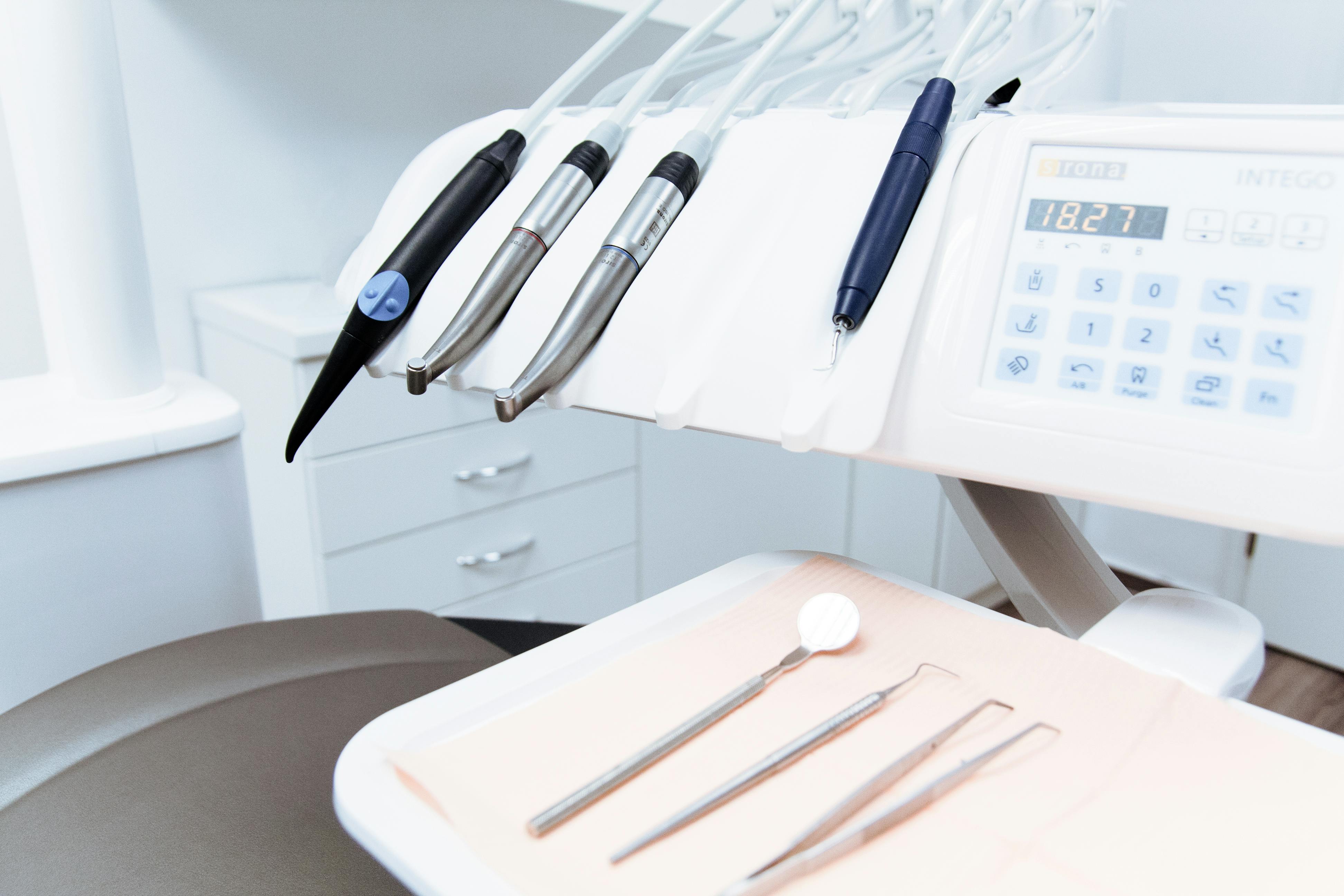
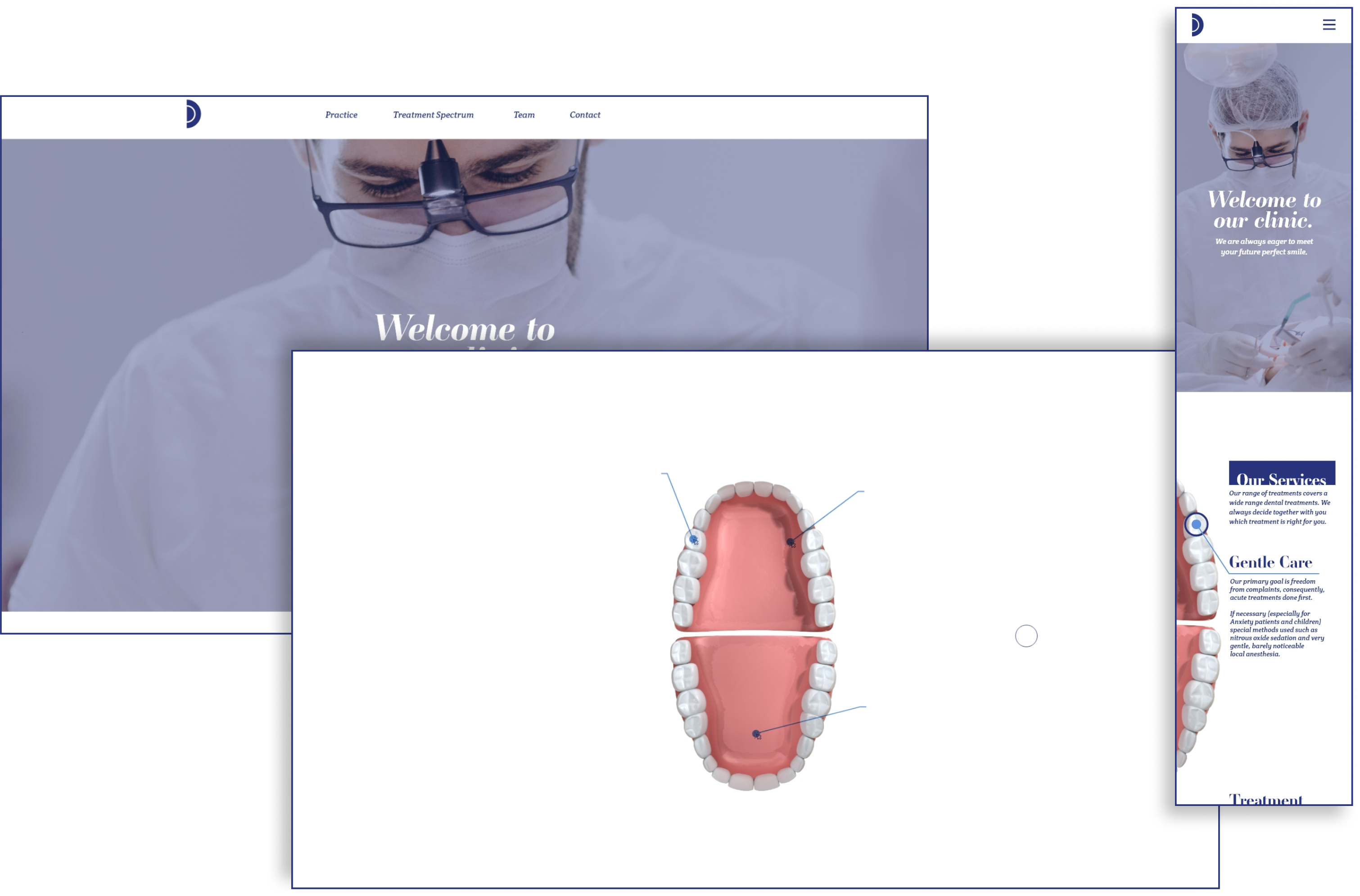
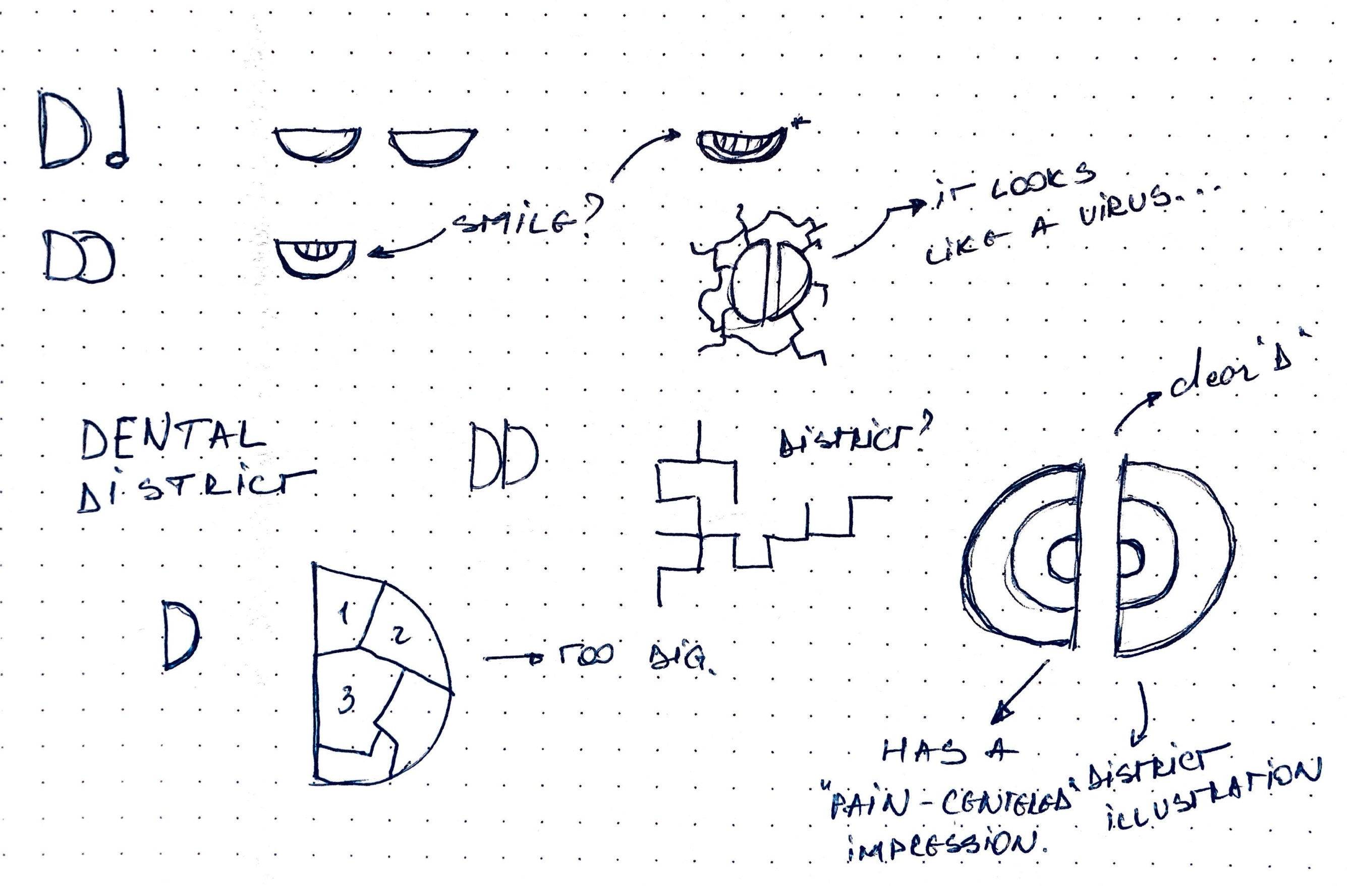
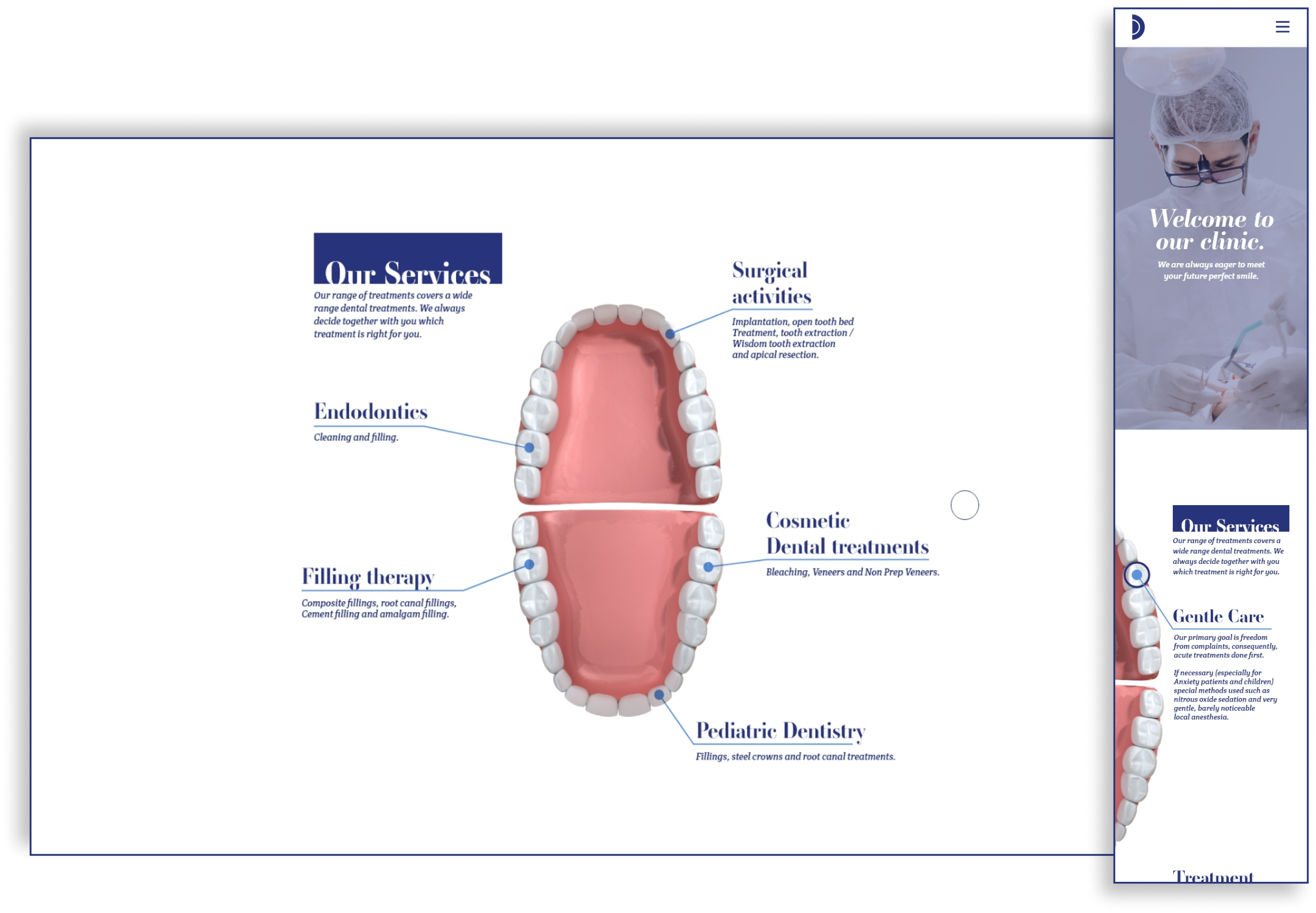
My client came to me with a multitude of problems: he wanted a logo, a brandbook and an engaging website and he had none of those things. But out of all, the most challenging was the website. The challenge was that generally, people look up a dentistry website when they have a problem already and they want to solve it. There is minimal exploration of the website and generally this is the reason why medical-related websites are made using a minimal, functional-oriented design. Not this time. My client wanted something “worth exploring” as he himself mentioned, but while keeping the minimalist touch. So I got to work.
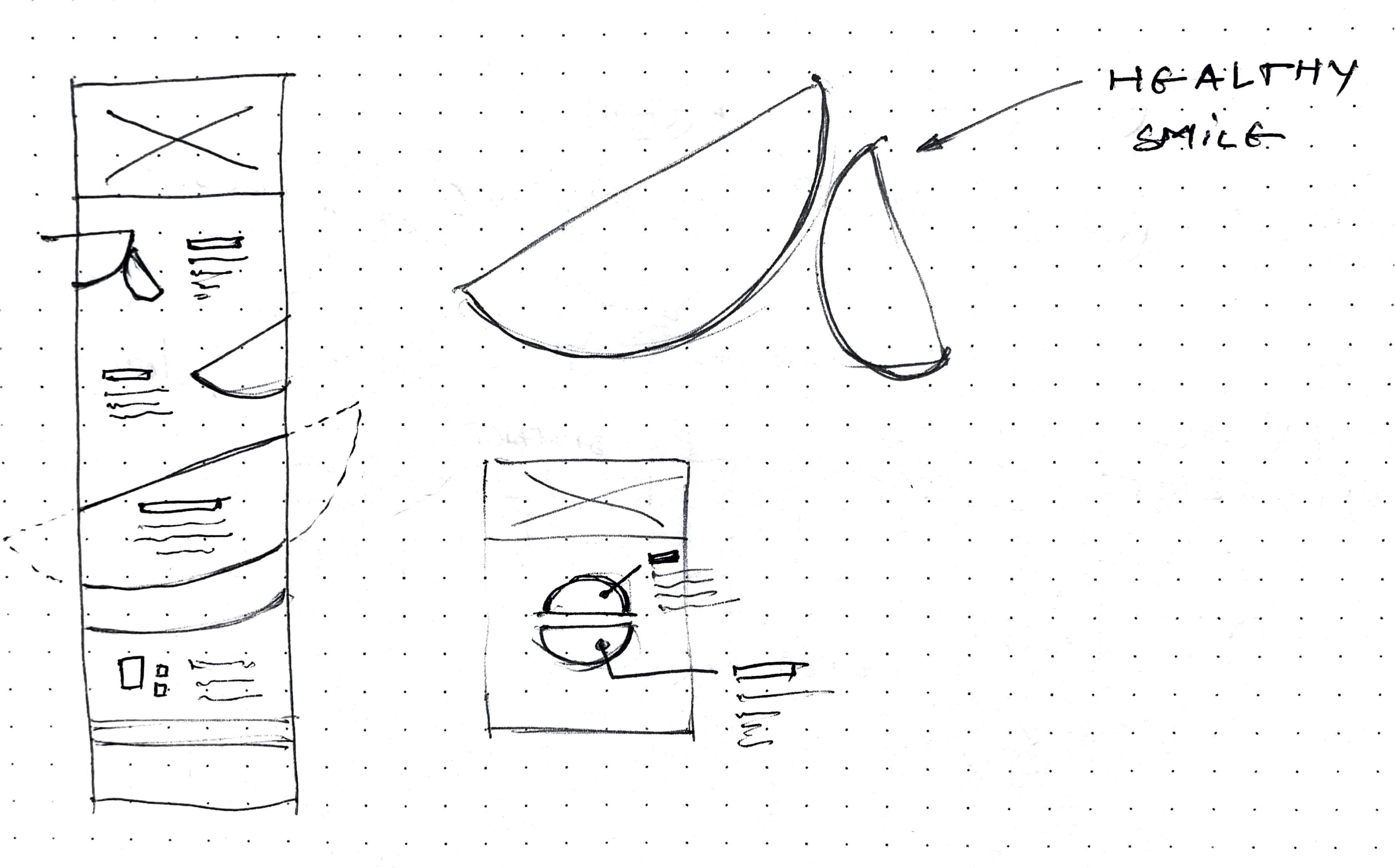
Research
As I expected, dentistry websites in the field presented a more functional approach, more oriented towards getting the users to reach what they need faster, rather than tailor an experience within the website. Rarely I found some websites that presented a little more focus on design itself rather than functionality.


