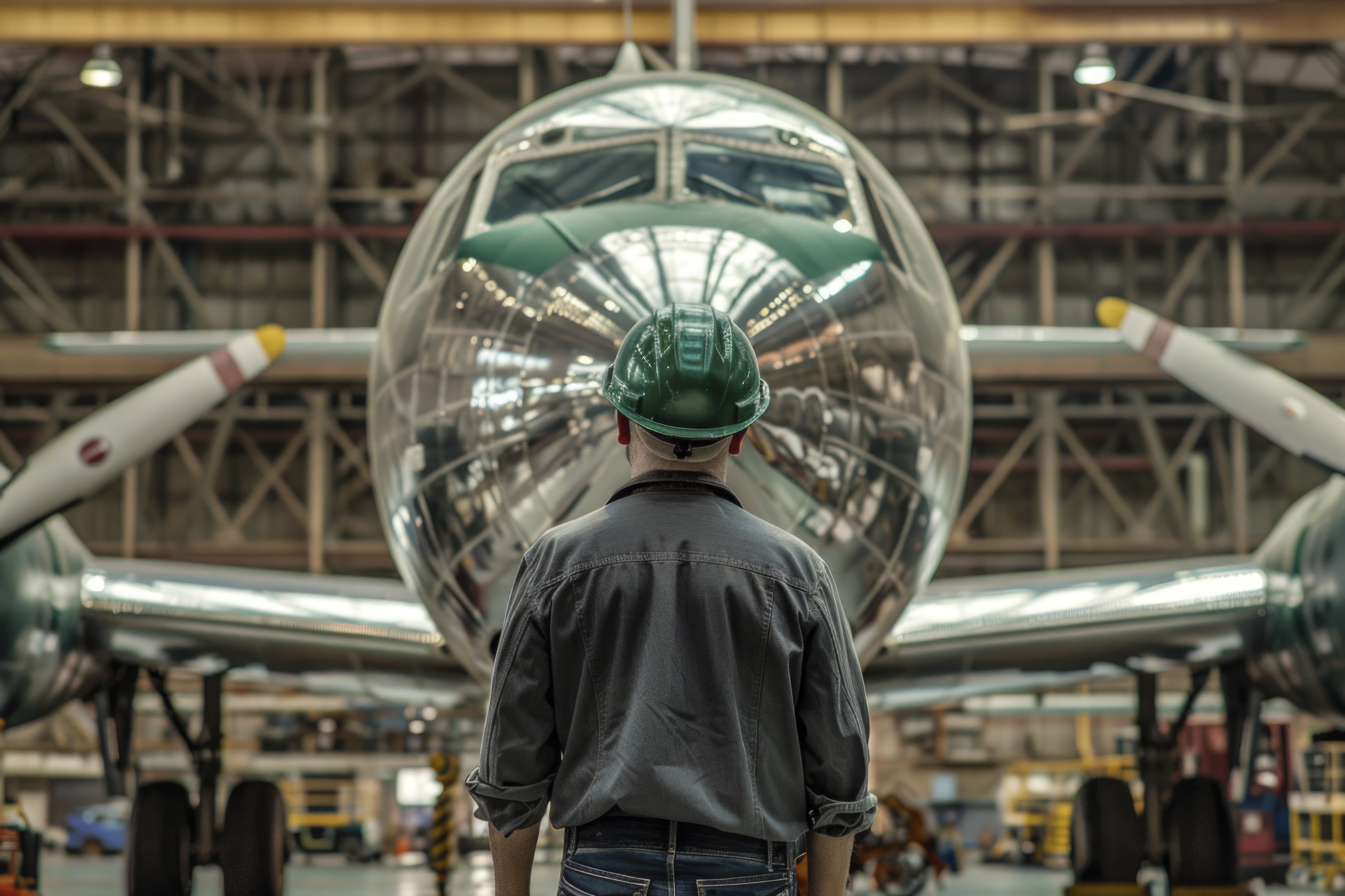
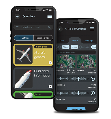
An inspection app designed for the staff.

The problem

I was approached by a very excited client with a very challenging product. He wanted to digitise the whole plane inspection process which was happening on paper at the moment of our discussion. The engineers would go inspect different parts of the plane, write down certain specifications, and then these specifications would be physically sent to an administrative office that would manually input this data. Imagine the hustle of the whole process..

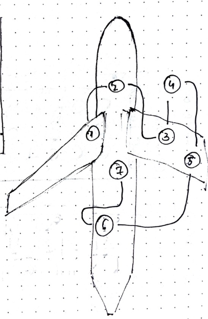
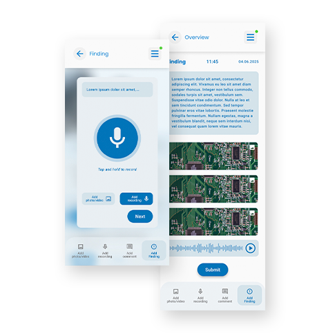
One of the key challenges of this product is that there is no straight way to go about an inspection process: There is no progress bar, no certain mandatory steps. Different engineers would be assigned to inspect different parts of the craft in no necessary order. The information sent to the server would be checked and approved directly by the admin.
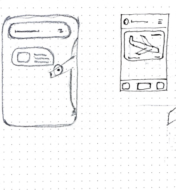
Research

These were some of the directions I was initially thinking of going towards. I did not find much inspiration as the project itself was pretty niche regarding UI and app logistics so i had to pick and choose which elements inspired me. I looked a lot for car UI designs, because I wanted something like a dashboard initially, with a lot of info around. The actual design ended up looking a bit different than what I imagined.

Ideation

As always, one of my best personal friends proved to be sketching. I started sketching mainly to clear my mind, but also because I had to actually adapt my personal view to content and situation. The first sketches were very vague, but as I started talking and understanding more of what the client wanted, things started to make sense.

Complex user flow

One of the most important steps of any development are user flows. This app was very complex so I had a lot of work in terms of user flows. Figuring out user's path throughout the app proved challenging because there were so many options and in the same time there were so many decisions that the user had to take.

Another challenge with this project is that the majority of the staff was not tech-savvy. I had to make the design very clear, easy to read and to understand and that meant less UI appeal sometimes. I had to sacrifice the beauty for function. And the function was dead important.

There are multiple ways to signal a problem within the app: Evidence, Finding, General or Video. The video component was added separately because all the other three categories would only require photos. Adding comments or recordings was recommended but not mandatory.

Not all the steps were mandatory, and a lot of them were governed from the server admin. If one inspection was completed, it was taked from the list or a new one was added based on Administrator input from the server towards the app.

I tried to make the app as clear as possible while keeping elements clean and appealing and having a clear visual hierarchy. The app is still under development but the design showed is ready for implementation as part of phase one.